The Ultimate Website Color Guide: Choosing the Perfect Palette for Your Online Brand
Introduction
Whether you’re starting a website from scratch or giving your current one a makeover, the visuals are a big deal. Think of this guide as your trusty sidekick, here to help you choose the perfect colors to make your website pop!
Why does it matter? Let’s talk about brands. Have you ever noticed how many tech companies use sleek shades of blue and white in their logos? That’s not by accident. Together, these colors create a sense of trust and innovation.

So, now it’s time for your website to step into the spotlight. Here’s the critical question:
What mark do you want your brand to make in people’s minds?
Why Website Colors Matter
Colors are like the secret sauce of web design – they can spark all sorts of feelings just by being there. Get this: Color psychology is no joke. Would you believe that a whopping 93% of consumers say color is the most important thing when making a buying decision?
Facebook famously decided to change the color of their “Sign Up” button from green to blue. This simple change turned out to be pretty significant, as loads more people started signing up. The reason? These blue hues fit Facebook’s style, and it’s easier for people to spot and recognize. This made the button more user-friendly, meaning more interaction.
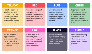
Amazon’s use of orange for their “Add to Cart” and “Buy Now” buttons is a super color strategy. Why? Because orange is often associated with urgency and action, encouraging customers to complete their purchases quickly. This contributes to higher conversion rates and sales on the website.
Hold up, though. Slapping an orange call-to-action button on your website won’t make you Jeff Bezos. It’s all about getting two colors to play nicely together. So, get cozy while we get into the what, how, and why of creating color palettes.
Creating Your Website Color Palette
To achieve the perfect color palette for your website, you need to understand what you want to convey. If you’re going for a fancy, high-class vibe, think about adding some black. People see black as elegant and top-notch, giving your site an air of quality and mystery.
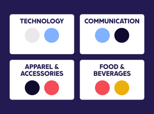
The colors you choose should match what you’re offering. Sure, black’s cool, but it might not capture the excitement of orange. If you’re in the tech game, blues might be your jam. They stand for safety and security—just peek at the branding of big shots like banks and tech giants.
Remember to think about how your logo and marketing will affect them. Colors aren’t just shades but messages loaded with meaning. Think lush greens of nature or the money that society connects it. These hues will gently nudge the folks who drop by your website or scroll through your social feeds.
Want to know how to create a website color palette? Here are the 4 steps to consider:
1. Pick a Primary Color
The best way to pick the perfect primary color is to start by thinking about the vibe of
your product or services and then discover colors that fit that brand vibe to find one you like.
Your website’s primary colors are like your online first impression; you want to make it a good one, so let’s have a quick website color scheme overview. Here’s a look at different colors and meanings of what each represents and how they might fit your business:

White
Example – Apple, Nike, and Google.
Represents – Psychologically, white signifies purity, clarity, and simplicity, often associated with a sense of new beginnings and cleanliness.
Digitally – On screens, white is a canvas of space, imparting a feeling of spaciousness and minimalism, making it a popular choice for modern and clean website designs.
Best For – Brands in the technology, healthcare, and lifestyle sectors, as it evokes a sense of sophistication and trustworthiness.
Black

Example – Chanel, Adidas, and The New York Times.
Represents – Psychologically, black conveys sophistication, power, elegance, authority, and a sense of seriousness and prestige.
Digitally – Black creates a backdrop of contrast that enhances the visibility of content, making it a favorite for sleek and stylish website designs.
Best For – Luxury goods, high-end fashion, tech gadgets, and products that aim to emphasize their premium quality and exclusivity.

Brown
Example – UPS, Hershey’s, and Timberland.
Represents – Psychologically, brown signifies reliability, warmth, and a down-to-earth sensibility.
Digitally – On screen, brown brings a sense of authenticity and a natural touch, making it suitable for brands that want to establish a genuine and approachable online presence.
Best For – Products related to coffee, chocolate, organic goods, outdoor gear, and homely or rustic items, as it aligns with qualities of coziness and reliability.
Red
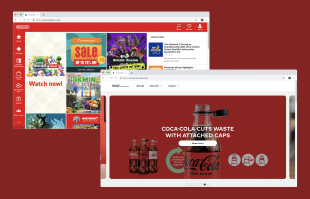
Example – Coca-Cola, Nintendo, and Target.
Represents – Psychologically, red evokes emotions of urgency, excitement, passion, and love.
Digitally – On screens, the color red commands attention, making it an effective choice to highlight the important elements, features, or calls to action.
Best For – Brands in the food and beverage industry, entertainment, sports, and urgent services, as it captures the essence of lively engagement and immediacy.

Yellow
Example – McDonald’s, Snapchat, and IKEA.
Represents – Psychologically, yellow represents happiness, optimism, and playfulness, often invoking feelings of joy and a sunny disposition.
Digitally – On screens, yellow gives a vibrant and cheerful aura, making it effective for catching attention and creating an energetic atmosphere.
Best For – Yellow is well-suited for brands in the fast-food sector, children’s products, creative industries, and brands that just radiate positivity and enthusiasm.
Green

Example – Whole Foods, Starbucks, and Animal Planet.
Represents – Psychologically, green signifies freshness, growth, and harmony with nature, giving a sense of balance, color harmony, and tranquility.
Digitally – On screens, green creates a calming and refreshing visual experience, making it suitable for brands that want to be associated with well-being and eco-friendliness.
Best For – Brands in the organic and health sectors, as well as environmental initiatives, and travel and adventure businesses.
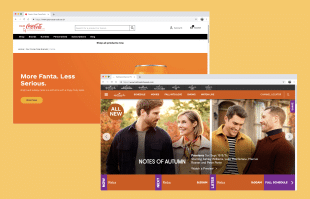
Orange
Example – Nickelodeon, Fanta, and Amazon’s delivery service.
Represents – Psychologically, orange radiates warmth, enthusiasm, creativity, and feelings of energy and excitement.
Digitally – On screens, orange adds a vibrant and inviting touch, making it an effective accent color for drawing attention to something specific.
Best For – Brands related to entertainment, snacks, innovative products, and services that aim to bring joy and dynamism to their target audience.
Blue

Example – Facebook, IBM, and American Express.
Represents – Psychologically, the color blue signifies dependability, wisdom, trust, and feelings of calmness and reliability.
Digitally – On screens, blue gives a sense of professionalism and trustworthiness, making it an excellent color choice for brands that want to convey stability and security.
Best For – Brands in the tech industry, financial institutions, healthcare, and services that require a sense of reliability and authority.
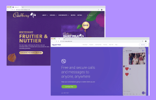
Purple
Example – Hallmark, Cadbury, and Twitch.
Represents – Psychologically, purple conveys luxury, wisdom, mysticism, and feelings of sophistication and uniqueness.
Digitally – On screens, purple adds an air of elegance and intrigue, making it suitable for brands that want to convey a sense of exclusivity and creativity.
Best For – Brands in the realm of art, spirituality, high-quality goods, and services that aim to stand out with a sense of royal distinction.
2. Choose Complementary Colors
Once you’ve picked your primary colors, it’s time to choose the secondary and tertiary colors that will work alongside them. Conveniently, each color already has a buddy that makes it pop perfectly, known as complimentary colors.
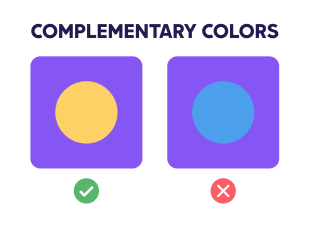
For example, imagine a yellow circle on a purple background. It’s gonna catch more attention than a blue circle on the same purple background. Still, that blue circle’s REALLY going to pop on an orange backdrop.
So, if your website is all about purple, think about adding a splash of yellow. Use it for important features like CTA buttons or key features.
Keep it simple, though— try and stick to one or two colors on top of your main one. The magic number is usually four or five, but go overboard, and things might get messy; too many primary and secondary colors together, and nothing really stands out.
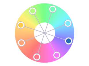
Using a color wheel is the best way to work out complementary colors. To find the best matches, look for two analogous colors directly opposite each other on the color wheel. You can find analogous colors for the three primary colors at the points of a triangle on the color wheel below.
When you think of Spotify, you probably imagine that vibrant green logo. Their use of green isn’t just random – green symbolizes growth, freshness, and energy. Now, combine that with black, and it creates a dynamic contrast with a modern and innovative vibe.
Remember, the key takeaway here is that the choice of colors can be a game-changer for your brand’s identity and how people perceive it. Using a color wheel can help find colors that not only compliment your branding but really help it pop off the page.
Just like Spotify, strategic use of certain colors really can communicate your values and personality, making your brand unforgettable.
3. Think About The Background
When it comes to choosing website color schemes, you cannot underestimate the importance of picking the right background color for your website. After all, the background occupies a substantial amount of website space, so the color you go with kinda matters.

You might decide to opt for an off-white or beige background for your entire website. Neutral colors or two shades together like this are a popular choice for good reason – it’s unobtrusive and doesn’t distract from the content. This kind of background plays nice with text, images, and links, allowing them to leap off the page.
On the flip side, it’s worth exploring the possibility of using a slightly muted version of your primary color as your background color. This approach can serve to reinforce your brand’s identity and message. However, keep in mind that in such cases, you might need to think about how you will display your written content to make sure it’s readable.
So, when choosing a background color, consider the impression you want to give, the mood you want to make, and how you can make your content shine against that backdrop. If the website’s canvas is yours to paint, then the background color is your first stroke.
4. Don’t Forget Fonts
As we come to the end of our colorful journey, there’s one more detail to dive into: finding the right font color for your website. Once you’ve picked the perfect font for your website, it’s time to choose its color. Sure, black’s the go-to color in traditional print, but take a tour around the internet, and you’ll soon see it’s not as common on screen as you may have thought.
Why? Well, using solid black text on a white background might look like the clear choice, but it can actually strain your eyes due to the 100% contrast. If your website’s text becomes a chore to read, then your visitors could very well start to click away somewhere else.

Now, using super bright colors for text is usually reserved for links and vital info, but there is a simple yet effective alternative: you can try using various shades of gray or subtly tinted colors. This gives your website a warm and welcoming atmosphere (plus making it much easier on the eyes).
Want to dare to be different? While the use of colored fonts isn’t usually used outside of promotional pop-ups or logos, don’t let that stop you from trying new things. Just keep in mind that colored text might create readability issues. The rule of thumb? Experiment, but do it carefully. After all, making your content a breeze to read is a step you don’t want to skip.
Try Some Palette Tools
If you’re searching for some inspiration but struggling to find the right complementary colors, then we’ve got your back! Here are some of our favorite, user-friendly (and free) tools to help you pin down the perfect color palettes.
COOLORS
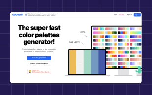
With Coolor you can discover trending color wheel palettes and find inspiration to create your own. Just choose a base color, then click to sift through random complimentary color wheel palettes.
Once you’ve found at least one color combination, click the “lock” icon to save it. Add or remove other colors from your palette, lock preferred colors in place, and you’ll soon create a perfect palette.
COLORMIND
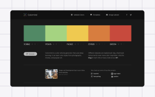
Colormind is a super basic color tool but in a good way. It works in much the same way as Coolors, making it perfect for beginners.
Click “Generate” to create random color schemes, or add the hex code for your primary color to find a palette that perfectly matches certain colors to your chosen hue.
PALETTON
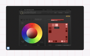
Paletton makes it simple to discover new color palettes. It’s perfect for people who might already have brand colors but are looking to create a full scheme that complements their business.
With Paletton, you can also choose between existing color palettes or totally custom color palettes and schemes. It even shows the different shades and tints to really help you really hone in on the perfect hue.
Top Website Color Tips
Now your website’s cohesive color palette and theme are taking shape, check out these bonus tips to compliment those color palette choices.
-
Contrast is Key:
Pair colors with strong contrast to make text and essential elements stand out. Dark text on a light background or accent color and vice versa makes sure things are clear.
-
Similar Saturation:
Using different colors with consistent saturation levels helps achieve a balanced look, making sure no single color overpowers the rest, providing a pleasing visual experience.
-
Use the Rule of Three:
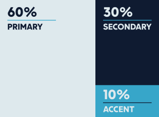
Apply three colors – a primary, secondary, and accent color – for well-rounded color palettes that keep attention AND consistency.
-
Balance with Complementary Colors:
Colors opposite each other on the color wheel – like blue and orange – add dynamic contrast without overwhelming the eyes.
-
Stay True to Your Brand:
Your website color palette should reflect your brand’s personality and values, helping build a consistent identity.
-
Varied Saturation:
Try experimenting with different saturation levels of the same color to keep your web design fresh. Lightening or darkening a color creates subtle contrasts that catch the human eye.
-
Test for Accessibility:
Check your color consistency across different platforms and devices. Colors can impact readability, so ensure your website color palette also meets accessibility standards for all users.
-
Think Cross-Platform:
Colors may appear differently on various screens and devices. Test your color palettes across different platforms to ensure consistency.
SUMMARY
It doesn’t matter if you’re choosing color combinations for a new business or updating an existing brand. Here are the basic steps you’ll want to take when it comes to picking the perfect colors for your website:
1. Pick a Primary Color – Choose a main color that tone of your product and service, or works with any existing branding.
- Choose Complimentary Colors – Select between 2-3 complementary colors you can use alongside your primary one to really help it stand out.
- Think about the Background – Choose a background color for your website that’s a little more muted and works behind your main color choices.
- Don’t Forget Fonts – When selecting a font color, make sure you take all other color choices into account to make sure people can see your text.
And what about if you build a free website with Hocoos AI? Then you get to choose! You can either create your own custom color palettes from scratch or let or AI wizard create them for you.
And it’s not just websites themselves. Hocoos AI does it all, from page, widget, and blog content creation to logo generation and auto-image completion. In fact, Hocoos has everything you need to create and host your website in under 5 minutes.
Not built your free website yet? It’s as easy as answering 8 quick questions (and much quicker than the time it took to read this article)
FAQ
Q1. How do I find a good color palette for my website?
A1. Identify your brand’s emotions and values, research color theory and psychology, and experiment with color tools to find a color palette.
Q2. Can I change my website’s color palette later without affecting my brand identity?
A2. Yes, you can change your website’s color palette later, but it’s important to do so thoughtfully to ensure it sticks with your brand identity and maintains a consistent user experience.
Q3. What is the best color palette for an online store?
A3. Use calming colors like blues and greens, add accent colors for emphasis, and choose colors that align with your products or services.
Q4. How many colors should a website have?
A4. The golden rule is to try and keep it between 3-5 main colors for cohesion, and to avoid clutter.
Q5. Can I create a free color palette?
A5. Absolutely, use online tools like Coolors or Paletton for creating and exploring color schemes.
FOLLOW us


