¿Cuáles son los elementos clave de una navegación efectiva en un sitio web de portafolio?
Una navegación positiva está asociada con varios principios básicos que afectan la experiencia general del usuario. Estos son algunos principios primarios:
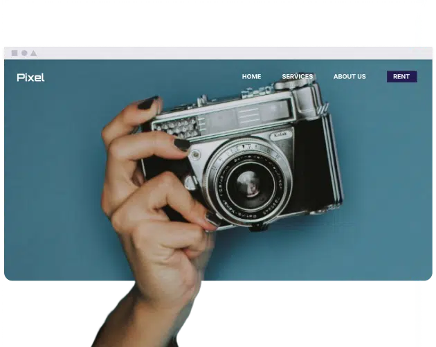
- Diseño sencillo y limpio: Evita diseños recargados que puedan distraer a los clientes. Concéntrate en tu trabajo y usa menús simples como Inicio, Portafolio, Acerca de y Contacto.
- Optimizado para móviles: Asegúrate de que tu portafolio funcione a la perfección en todos los dispositivos. Más de la mitad del tráfico web proviene de dispositivos móviles.
- Navegación simple: La navegación de portafolios más grandes puede verse influenciada por la presencia de cuadros de búsqueda. Además, habilita las rutas de navegación, que rastrean el movimiento de un usuario en todo el sitio.
- CTAs: Acompaña a los clientes con llamadas a la acción (CTA), como "Contrátame", "Ver mi trabajo" o "Contáctame". Asegúrate de colocarlas en el centro de la página de inicio, así como en las páginas del portafolio.
¿Cómo mejora una buena navegación la experiencia del usuario en un sitio web de portafolio?
Un sistema de navegación fácil de usar y eficaz tiene implicaciones para la interacción de los visitantes con tu portafolio, así como para su satisfacción. Así es como impacta la experiencia del usuario:
- Menús y etiquetas intuitivos: Comprender las necesidades de los usuarios ayuda a una mejor segmentación de los menús de navegación.
- Navegación estandarizada: Acciones similares deben ubicarse en los mismos lugares relativos en todas las páginas.
- Pruebas y optimización: Cambia la estructura de navegación según los comentarios de los usuarios y actualízala periódicamente.
¿Cuáles son algunos errores comunes que se deben evitar en la navegación del sitio web de un portafolio?
Para que tu portafolio sea más fácil de usar, hay algunos errores de navegación específicos que debes evitar. Estos son algunos de ellos:
- No prestar atención a la velocidad de carga: La optimización de la estructura del sitio web y las imágenes es necesaria para una mayor rapidez carga.
- No mostrar el menú de navegación: Asegúrate de que tu menú sea claramente visible en las versiones de escritorio.
- Ofrecer demasiadas opciones: Evita abrumar a los visitantes con una gran cantidad de opciones; procura facilitar su toma de decisiones.
- No mantener la coherencia entre dispositivos: Un buen sitio web está diseñado para permitir una navegación intuitiva, independientemente de la variedad de tamaños de pantalla.
¿Cuáles son los diferentes tipos de navegación que se usan comúnmente en los sitios web de portafolio?
Los sitios web de portafolio emplean diferentes estilos de navegación según las necesidades de diseño y contenido. Estos son algunos de los diferentes enfoques:
- Barra de navegación horizontal: Un menú de texto ubicado en la parte superior del sitio, a veces diseñado para permanecer visible durante el desplazamiento.
- Menú hamburguesa: Un ícono de menú de tres líneas optimizado para dispositivos móviles.
- Mega menú: Un panel grande que muestra todas las categorías y subcategorías en sitios web de comercio electrónico.
- Menú desplegable activado al pasar el cursor: El segundo nivel de categorías se muestra al pasar el cursor.
- Barra lateral vertical: Un menú en el lado izquierdo de la página.
- Menú de navegación del pie de página: Opciones de navegación ubicadas en la parte inferior del sitio web.
¿Cómo puedo probar y mejorar la navegación de mi sitio web de portafolio?
Para que la navegación sea fácil de usar y efectiva, debe probarla y estar dispuesto a mejorarla. Esta es la forma en que debe hacerlo:
- Pruebas de usuario: Consiga que usuarios reales interactúen con el sitio y den su opinión.
- Prueba de árbol: Pruebe qué tan bien los usuarios pueden navegar por su sitio web.
- Analítica: Monitoree el comportamiento del usuario en su sitio web utilizando herramientas como Google Analytics.
¿Cómo se pueden integrar el diseño visual y la marca en la navegación de un sitio web de portafolio?
Como cualquier otra parte de su sitio web, la navegación debe reflejar su marca. Así es como puede combinar diseño y marca para su sitio web.
- Coherencia: Mantenga los mismos colores, fuentes y posición del logotipo en toda su marca.
- Funcionalmente atractivo: Esfuércese por tener un sitio web atractivo, pero asegúrese de que todos los elementos añadan una función adicional.
- Marca adaptable: Cambie los diseños de la marca para diferentes tamaños de pantalla.
Conclusión
Una navegación del sitio bien construida es necesaria para un sitio web de portafolio efectivo. Al prestar atención a detalles como la simplicidad, la adaptación móvil, las actualizaciones continuas y la claridad, ayudas a los usuarios a lograr sus objetivos, desde analizar tu trabajo hasta contactarte, de manera apropiada.