Why is a header important?
Table of Contents
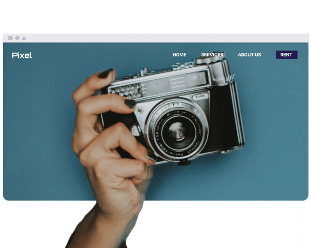
Website headers are a first impression, and users will view these through the lens of whether they want to stay on the website. Brands use site headers to establish a website identity, which target audiences will also look out for.
What are the most common things found in a website header?
Website headers have various elements, including:
- Logo: Companies put their logo in their site header for branding purposes.
- Navigation menu: The about page, products section, and everything else is normally in the header.
- Search bar: Allows users to look for specific content on your website.
- CTA buttons: Calls to action for getting in touch, signing up for a free trial, etc.
- Social media icons: Links to Instagram, LinkedIn, X, etc.
Logo
Some businesses include their logo in their site header, but it isn’t a federal rule. Choose wherever makes the most sense for your logo to appear (i.e. where it’s the most visible to your audience).
Logos in a website header shouldn’t be so big that they consume the entire page. Resize according to your layout.
Navigation Menu
The navigation menu consists of the website’s key pages. For example, users may access a website blog via the navigation menu or look more at the different products available.
Navigation menus normally include around five elements, but they shouldn’t be too clunky. Start with the following:
- Home
- Blog
- Products/Services (including subpages in a dropdown menu)
- About
- Contact
Navigation menus also have different language options if these are available.
Search Bar
The search bar is where users will look for blog posts and other pages on your website. Several site themes have search bars, but some businesses prefer to use plugins.
The search bar can either be in the form of a magnifying glass icon or a text box.
CTA Buttons
CTA buttons are anything that you want users to do when on your website. For example, some sites might have CTAs to sign up for a free trial.
Generally speaking, you should have 1-2 CTA buttons at most on your site.
Social Media Icons
Consider adding your business’s social media icons to your header page. Some site builders automatically generate the platform’s logo after you enter your URL.
You can choose whether you want your social icons to appear in black and white or color.
What makes an effective website header?
Website headers are more effective when they have fewer navigation tools. Users should know what they need to do without second-guessing, and fonts should be easy to read.
How important are CTA buttons in a website header?
CTA buttons are supposed to show users to specific parts of your website. Many websites have CTAs for converting specific traffic.
Use CTAs for:
- Directing traffic.
- Conversions.
- User experience.
How can I make my header easy to navigate?
Improving header navigation requires sticking to some core components. These include:
- Layouts: Menus should be horizontal or vertical, and they should be whichever you choose across the whole website.
- Links: Start with the main website pages; build out later if you need to, but don’t sacrifice the user experience.
- Labels: Check that all menu items indicate where they lead to. Verify all links before publishing, too.
How do I choose the right layout for my header?
Picking the right layout for your header requires thinking about everything else that will appear on your site. The header should align with your brand personality, target, audience, and on-site content.
Websites with more content might need a bigger header. On the other hand, you should use a simpler design if you only have one or two products and services.
The level of technical experience your audience has also determines how intuitive the layout should be. For example, if you cater to a B2C audience, it should be very straightforward.
Do all websites need a header?
Most websites should have a header, but there are some exceptions to the rule. For example, highly creative and single-page designs might not need a header. On the other hand, brands requiring a specific action – such as booking tables at a restaurant – should have a header.
If you need to prioritize one or the other, you should pick the menu in your header over a logo. It’s also worth thinking about how you can stand out, as sometimes, going against the grain will lead to better results.
How do you choose your header’s design?
Headers should highlight your brand identity and demonstrate your website’s purpose. It should also include elements required to navigate the website appropriately.
It’s unlikely that you’ll get your header right the first time around, but you can ask for feedback and evaluate what works.
Can website headers affect SEO?
Yes; headers with clear navigation tell search engines what your structure and content overview is. Google prioritizes user experience, meaning that site headers indirectly impact results.
Should a mobile website header be different?
Since users access mobile sites on smaller screens, website headers often need to be different on these devices. Some sites use a hamburger menu consisting of three lines, which uses space more efficiently.
When designing a site header for mobile, you should still prioritize the main elements on your website.
Conclusion
Most websites should use headers, and you also need to prioritize the main elements. CTA buttons, site navigation, and social media icons can all be added to a website header.
If you use a site header on mobile, make sure it fits the screen. A hamburger menu might benefit you in this circumstance. Apply the information you’ve learned today to put together a stronger website, but don’t expect things to work right away; be prepared to experiment.