色彩对比在移动设计中的重要性是什么?
色彩对比的重要性取决于它如何:
- 影响视觉层次
- 方便用户导航
- 吸引用户
它是如何在移动屏幕上安排不同元素以达到最佳效果的基础。
通过有效利用色彩对比,可以将用户的注意力引导到屏幕的重要部分,例如 行动号召 或导航按钮。此外,只要文本和背景颜色之间有足够的差异,此方法还可以提高可读性。
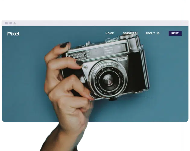
示例: 在宁静的背景下,橙色的按钮自然会成为焦点。同样,在文字颜色和背景颜色之间建立良好的对比度,可以减少眼睛的疲劳。
专家提示:
为了在移动设备上获得最佳体验,使用正确的颜色对比至关重要。
色彩对比在可访问性方面有哪些优点和缺点?
色彩对比度对可访问性有重要影响,既有合理的益处,也有一些微小的限制。在网站创建过程中,请考虑以下因素:
- 辅助功能调整: 针对视力和色觉障碍人士修改文本和元素外观。
- 以用户为中心的设计: 为具有不同视觉能力的个人定制易于访问和感知的内容。
- 改进的SEO: 无障碍设计的网站更受搜索引擎青睐。
- 设计因素: 确保适当的对比度可能会限制某些颜色组合。
- 测试要求: 需要使用不同元素的对比度来验证程序和测试。
谁会受益于具有足够对比度的设计?
许多人受益于高对比度的设计。这些设计对视力低下、色盲,甚至因年龄导致视力障碍的人都有益处。 辅助功能 对每个人都至关重要。W3C 就使用万维网联盟 (W3C) 网络内容无障碍指南 (WCAG) 创建可访问的网络内容制定了具体指南。受益于颜色对比的群体通常包括:
- 视障人士: 这组人群包括弱视或色盲人士;对比度有助于他们在网站上阅读和查看文本,甚至可以区分链接和按钮。
- 老年人: 许多老年人经常反映,随着年龄的增长,他们感知细节的能力(即视力和对比敏感度)有所下降。足够的对比度有助于精确识别图像特征,而对比度不足则会影响清晰度。
- 不同环境下的用户: 在高亮度环境下(例如户外),高对比度的设计形式可以帮助用户。
- 整体用户体验: 适当的视觉/设计对比度对每个用户都至关重要,有助于理解和阅读。
专家提示:
适当的对比度固然重要,但避免过度使用也同样重要,因为这可能会使设计看起来令人不快,甚至难以观看。在对比度的需求和用户的视觉舒适度之间找到恰当的平衡至关重要。
如何测试应用程序颜色的可访问性?
在检查可访问性问题时,务必验证应用程序在不同颜色下的表现,并检查颜色的对比度。测试 深色模式 辅助功能中的测试应包括深色图案、高对比度和灰度。
有一些工具,例如 Color Contrast Checker,可以根据 WCAG 标准比较背景和文本颜色。验证颜色对比度对于辅助功能至关重要,但它对于帮助视障人士也必不可少。同时,WebAIM 有一种通过使用对比度检查器来检查颜色组合的辅助功能的方法。
总结
色彩对比在移动设计中至关重要,因为它有助于提高可访问性, 创建视觉层次结构,并影响用户体验。 虽然个体反应可能不同,但研究表明,色彩对比与提高理解力和减少眼疲劳呈正相关。 这些因素共同作用,可以带来更强的专注力,最终有助于打造更易于访问、用户友好的整体体验。 色彩对比是开发的重要元素,可确保移动应用程序易于访问并兼顾各种用户。