






What are the standard components of a header versus a hero section?
While they sit together, their internal elements serve very different functional roles.
Standard Header Components:
- Markenidentität: A logo that typically links back to the homepage.
- Primary Navigation: Links to main pages like “Services,” “About,” or “Pricing.”
- Utility Tools: Search bars, language switchers, or login buttons.
Standard Hero Section Components:
- Main Headline (H1): A bold statement of the site’s primary purpose.
- Subheadline: A brief sentence providing extra context or social proof.
- Call to Action (CTA): A high-contrast button like “Get Started” or “Book Now.”
- Visual Media: A background image, video, or product illustration.
Where are they positioned, and what is the “Above the Fold” area?
In web design, “above the fold” refers to the content a user sees immediately upon loading a page without having to scroll.
- Header Position: Always located at the absolute top (the 0px mark) of the document.
- Hero Position: Situated directly underneath the header, often filling the remainder of the initial screen height.
- The “Fold”: Because these elements sit at the top, they are the most viewed parts of any website, making their clarity essential for reducing bounce rates.
Should the design of the header and hero section be visually integrated?
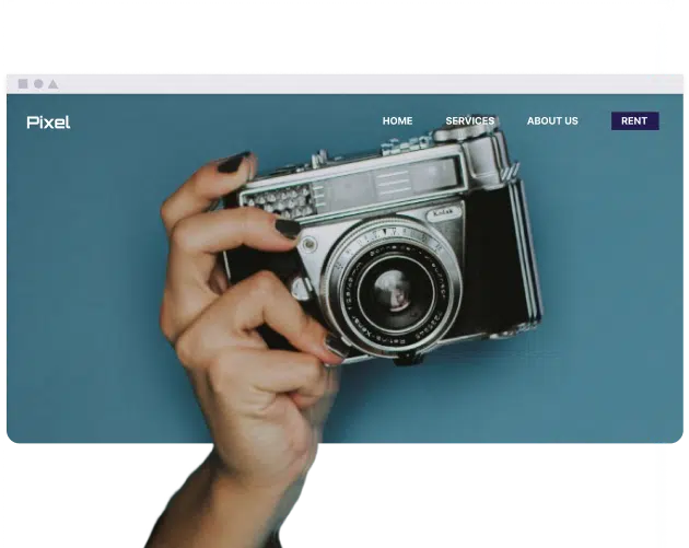
Yes, a seamless transition between the two creates a more professional and modern user experience. Many designers use a “transparent header” that sits on top of the hero image to make the page feel unified rather than fragmented.
| Funktion | Header (Navigation) | Hero (Conversion) |
| Primäres Ziel | Wayfinding and utility. | Engagement and action. |
| Konsistenz | Usually stays the same across all pages. | Often unique to the homepage or landing pages. |
| Vorteile | Improves site-wide accessibility. | Dramatically increases conversion rates. |
| Nachteile | Can become cluttered with too many links. | Can slow down page speed if images aren’t optimized. |
How do headers and hero sections adapt to mobile devices?
Since screen real estate is limited on smartphones, both sections must undergo significant structural changes.
- Header Transformation: Desktop menus are usually hidden inside a “hamburger” icon (three horizontal lines) to keep the UI clean.
- Hero Stacking: Elements that sit side-by-side on a desktop (like text on the left and an image on the right) are stacked vertically on mobile.
- Hocoos Example: AI builders like Hocoos automatically handle this responsiveness, ensuring the hero headline remains readable and the header navigation is accessible on any screen size.
How do they individually impact User Experience (UX) and SEO?
Both sections are critical, but they influence different metrics.
- UX Impact: The header reduces user frustration by providing a clear path to information. The hero section improves UX by immediately answering the user’s question: “Am I in the right place?”
- SEO Impact: The header establishes a clear site hierarchy through internal links, helping search engines crawl the site. The hero section typically contains the H1 tag, which is one of the most important on-page signals for search engine rankings.
Can a hero section exist without a header, or vice versa?
It is possible to use one without the other depending on the specific goal of the webpage.
- Hero without Header: Common on “squeeze pages” or dedicated landing pages where you want to prevent the user from navigating away until they complete a specific action (like signing up).
- Header without Hero: Frequent on content-heavy sites, documentation pages, or search results where the priority is getting the user straight into the data or text.
Fazit
The header provides the logic and structure of a website, while the hero section provides the emotion and the “pitch.” Utilizing both effectively—and ensuring they are optimized for mobile—is the foundation of high-performing web design.